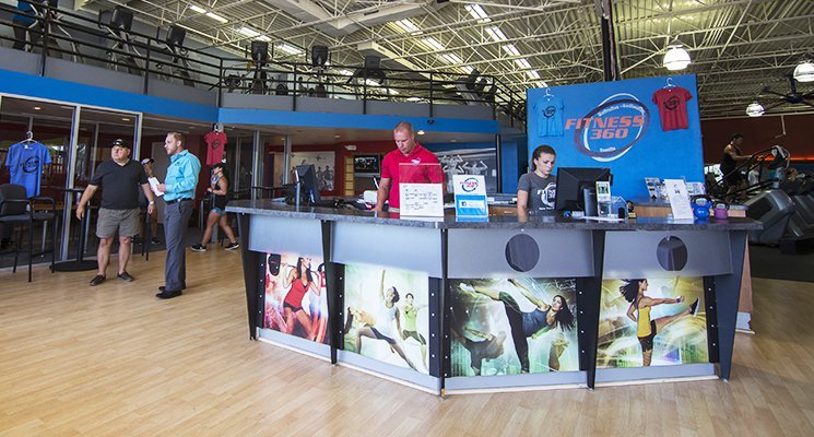
We all know the cliché: First impressions matter. Some social scientists have suggested that we size up new people, places, and things within thirty seconds of first encountering them, making decisions about them then and there. Of course, first impressions often are proven wrong — but sometimes, depending on the content of a given impression or the person forming it, there’s no chance to prove it wrong. Fact is, clichés are clichés for a reason: They tend to touch on some kind of truth. In the fitness and sports facility industries in particular, first impressions really do matter. Potential members might decide in a split second whether to sign up with your facility or not.
What gives someone a first impression of your organization? Your reception area, of course. Or, I should say, your reception areas, because in this day and age you likely have two: a virtual one and a bricks-and-mortar one. If you want to sell memberships effectively, you have to consider both carefully.
Let’s think first about the old-fashioned one, the bricks-and-mortar reception area. Remember, this space represents a transition from the outside world — that is, the world that contains a potential member’s stressors, responsibilities, and aggravations — to your facility. How do you want people who walk through your doors to experience that transition? Chances are, you want them intuitively and immediately to grasp that they’re entering a sanctuary, a safe harbor that will hold the stressors, responsibilities, and aggravations at bay. The more they feel that, the more likely they are to keep coming back. In other words, you want your reception area, that first-impression space, to do the work of fulfilling what are likely two of your facility’s main goals: signing up new members and retaining existing ones.
How do you accomplish this? First, ask yourself how warm, welcoming, and calming your reception area is. Is it a carefully designed space, with colours, lighting, fixtures, and signage that let people know you want them there, you’re friendly, and they can relax? Maybe you have a fountain, plants, yellow lighting angled just so. At the same time, is the space energizing enough to help people get into a workout mindset — a splash of bright colour on one wall, say, an image that suggests intensity and power? Does it look generic, as if a person standing there could be anywhere, or does it look like it could be only one place in the world: your facility, reflecting your identity? Do your front desk employees smile? Do they know members by name? (Of course, needless to say, the space should be uncluttered and impeccably clean.)
If you answered no to any of these questions, it’s probably time for an overhaul. An architect or interior designer can help you get started. One step you can take right away is researching current design trends for fitness and sports facility reception areas — and then being sure to avoid them. Part of the first impression you want to aim to create is the sense that your place is different, in a category all its own.
Now, what about your virtual reception area, a.k.a. your website homepage? In the old days, of course, this wasn’t something a gym owner or manager had to worry about. But the fact is that nowadays, people form an impression of your facility before ever stepping foot into it, and they do that by looking you up online. Take a good, hard look at your homepage ask yourself some questions. Some of the questions are similar to the ones you want to ask about your physical space: Is it warm? Is it welcoming? Does it set you apart from other facilities? But you also want to consider the following: Does the page load quickly? Does it avoid being overly busy? Does it reflect and reinforce your facility’s brand identity? Does it efficiently answer questions people are likely to ask, or provide obvious links to answers?
A final key point to keep in mind: Online impressions are formed not only through your facility’s webpage, but also via reviews on Google, Yelp, personal blogs, and other such pages. If you’re concerned about potentially negative impressions these kinds of sites might leave, or if you just have no idea how to begin approaching the issue, consider hiring an online reputation expert, someone who combs through existing pages about your business and strategizes ways to emphasize the good stuff.


